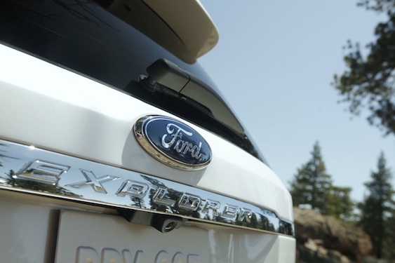
2011 Ford Explorer Interior Design and Special Features
We have mixed feelings about MyFord Touch, however, as those touch buttons can be difficult to identify at a glance and the corresponding touchscreen suffers from small button icons on a black background. The redundant steering wheel controls and speedometer-flanking LCD screens could also use a bit of fine-tuning. All together, it works better when stationary than when on the move.
The Explorer's cabin is more spacious than before, but it's not quite as roomy as those of the Dodge Durango, Ford Flex and especially the Chevy Traverse. Its 80 cubic feet of maximum cargo space is the smallest of the group and the third row is a bit cramped by comparison -- though it does accommodate children with ease. The driving position is spot-on for most drivers, though the Explorer's wide pillars and high dash make the car seem bigger when maneuvering through tight places.
Exterior Pics of 2011 Ford Explorer
Interior Design Pics of 2011 Ford Explorer


